jlucas
Amateur Artist

Posts: 3
|
Post by jlucas on Jun 19, 2005 21:52:14 GMT -5
Good day Sir Dan! here are my interactive layout studies. I played around 6 different layouts of the one you approved last friday. Main Page:  interface studies to follow soon. |
|
jephte
Amateur Artist
Posts: 4
|
Post by jephte on Jun 20, 2005 4:58:43 GMT -5
|
|
|
|
Post by Sir Daniel on Jun 30, 2005 0:46:37 GMT -5
Jephte I now know whats missing...the spider needs to animate a bit...and the spider web needs to have a "digital" look...not pixelated. Animate the spiders legs... per interface section... Make the digital web Please change your templates...  |
|
|
|
Post by Sir Daniel on Jun 30, 2005 0:55:43 GMT -5
:)Iha...this a far better design compared to the first ones you gave me... I now appreciate your "bakya-pinay" colours and text....good thing you changed the text to Filipino. Problem is the links just shows all the same thing.  The section tabs are quite large, please decrease it about 75% and distribute equally in a vertical fashion... Please proceed with the all layouts and present them tom. Great improvement! Good day Sir Dan! here are my interactive layout studies. I played around 6 different layouts of the one you approved last friday. Main Page: interface studies to follow soon. |
|
|
|
Post by Sir Daniel on Jun 30, 2005 1:06:39 GMT -5
Everythings alright leah....its just the 3D yellow car is dissappointing...better to render again. I love the tone-down, gray gritty neat layout...if you have a way to spice it up a little...a little variance would be interesting. Great work! [/IMG] [/quote] |
|
|
|
Post by Sir Daniel on Jun 30, 2005 4:13:48 GMT -5
|
|
|
|
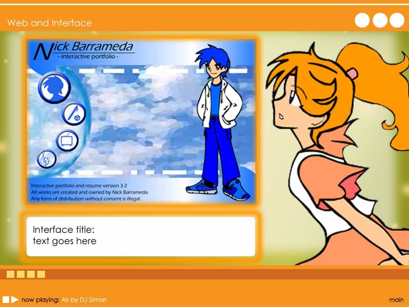
Post by Sir Daniel on Jun 30, 2005 4:17:54 GMT -5
You have a simple and clean layout nick...but please its too simple...the use of rectangular bars and solid color is just too much. Please spice up and freshen the interactive layout, you have a novel concept but it needs better application of thought... You can base the layouts in a comic manga panel design ...just thinking out loud or base it for a school - home layout... its just the simple solid bars with the vibrant colour is getting way too common. Overall good work! |
|